Disney+ Executive Shares More Details On Why The Disney+ Logo Changed
Back in March, Disney launched Hulu On Disney+ in the United States, bringing thousands of titles over the streaming service to bring it more in line with how it’s operated internationally for years, with content from Disney’s other studios like 20th Century Studios, ABC and FX.
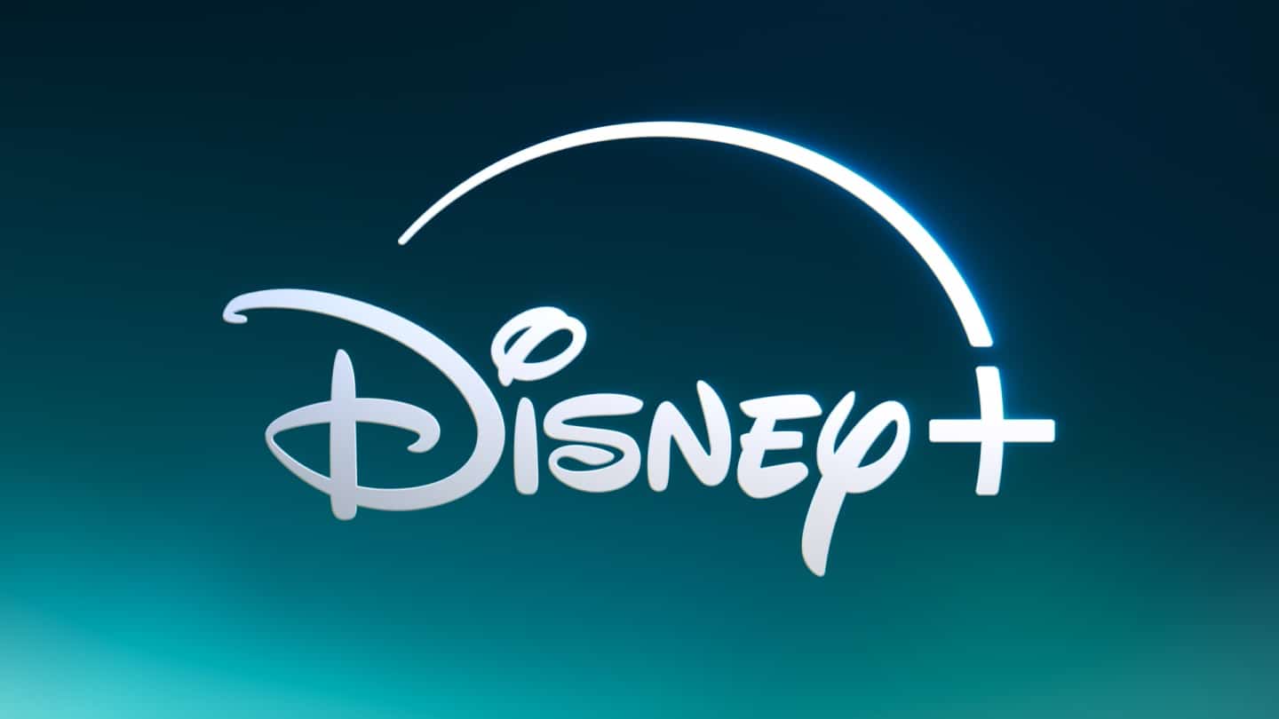
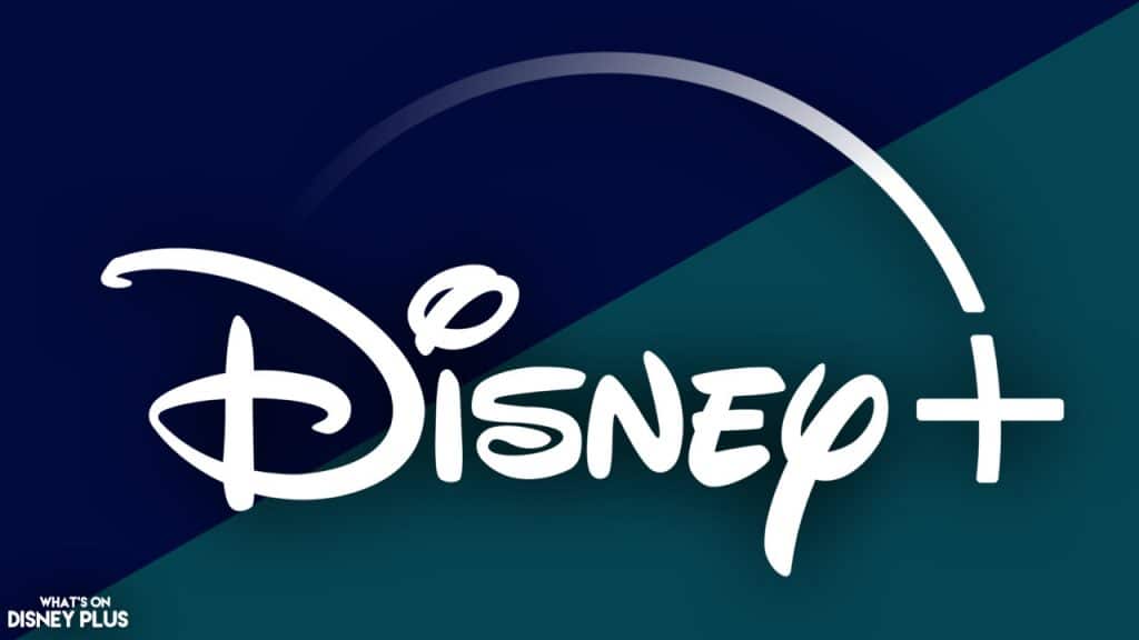
To coincide with the official launch of Hulu On Disney+, the streaming service underwent a major rebranding, including a brand new colour. Gone was the dark blue, and in came a new teal-like colour, which was inspired by Hulu’s signature green and Disney+’s legacy blue. The service was also updated with a refined logo, a new colour palette, and an orchestral mnemonic created by Academy Award-winning composer Ludwig Göransson.
At the time of the launch, it was revealed by Joe Earley, who is the President of Direct-to-Consumer at Disney Entertainment, that the colour was called Aurora after both the aurora borealis and also as a homage to Princess Aurora.
The main reason for the change in colour was that it represented a major change with the addition of Hulu content onto Disney+, and this slight change symbolised that things were different within the app.
Recently, Jackson George, svp of creative advertising at Disney Entertainment spoke with ADWEEK and shared some more details on the rebranding of Disney+.
“We always talked about the color, even before we had the opportunity to evolve that color. We talked about what the opportunity of Hulu coming to Disney+ was.”
Apparently, the branding change took almost nine months from start to finish to design, with Disney working with an agency called, Loyalkaspar on the final design.
“We put everything out on the table. We looked at a million different things. Some things are completely zany and radical. And a lot of those things are clearly not going to work but have a little piece of inspiration or something in them.”
He added that the new colour was generally always going to be focused around the blending of blue and green, the colours of Disney+ and Hulu.
“Reds, yellows, none of those things were really [considered]. It was just finding our way here. We wound through greener blues, bluer blues, midnight blues—I would say about as much range as you can see in the night sky is what we thought about and considered.”
There were apparently lots of zany ideas being thrown around, but the major thing this branding referenced was Hulu content integrating with Disney+.
“We’re not making something that reflects what we have been or necessarily what we are right now. This is something that reflects what we’re going to be.”
This comment from Jackson is something I think we need to focus on; it’s not just about the launch of Hulu On Disney+; it’s about the future of the streaming service. I’m convinced that eventually Hulu will be completely merged into Disney+, like it is everywhere else in the world. Running multiple streaming platforms isn’t cost-effective, and in a world of consolation, it makes sense that once Comcast is no longer a co-owner of Hulu, Disney will make the final step to merge Disney+ and Hulu.
This is likely why the design process was so lengthy: This is likely going to be a long-standing change, and now that the rebrand has been done, audiences can get more used to having mature content aimed at adults on Disney+.
With so many different streaming services, it’s vital that they stick out. Many of the streaming services have established a specific colour, like red for Netflix and green for Hulu. And it wasn’t lost on the designers that the colour change has helped establish Disney+ away from some of the other blue apps like Max or Paramount+
“I can’t say we didn’t notice. But I think that the greater idea was always more about distinguishing ourselves for ourselves rather than distinguishing ourselves in reference to others.”
But it wasn’t the colour of Disney+ to go through a change, as they also slightly tweaked the logo, as they had found after working with it for a few years that the transparency of the arc had made it harder to work with, along with irregularities in the logo, such as the thickness of the plus symbol and the spacing between the plus symbol and the Y in Disney—which have also been updated.
“We didn’t want the arc to feel like an afterthought or a whimsical flourish. We wanted it to feel like our brand identity. You’ll notice now the lock-up [between the arc and the plus] is always there. It does not draw on. It has a more always-existing quality to it.”
Roger’s Take: It does seem crazy to think that it took a team nine months to make the design changes to Disney+, but with a major million-dollar business and lots of input from different people, it’s going to take a while to get organised and, more importantly, agreed on. I’ll be honest and say it took me a while to warm up to the new Aurora colour, but I’ve gotten used to it now. With the rebrand going global, without the Hulu element (yet!), for most of the world, the rebranding is meaningless, but from the US standpoint, this was a big shift in the direction for Disney+, to which Hulu and also ESPN are going to become even a bigger part of.
What do you think of the new Disney+ Logo? Let me know on social media!
