New Survey Reveals Disney+ Design Needs Improvement
It’s been almost four years since Disney+ launched, and in that time, we’ve seen some small changes to how Disney+ looks and works. There was the addition of the Star hub across international markets, the introduction of special live stream events and an upgrade of its parental controls. But, on a surface level, the actual design of Disney+ hasn’t changed much in a few years.
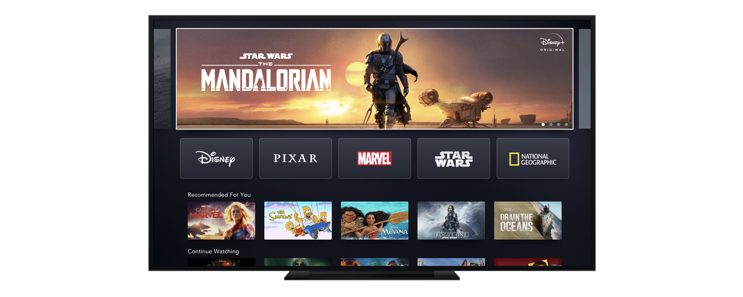
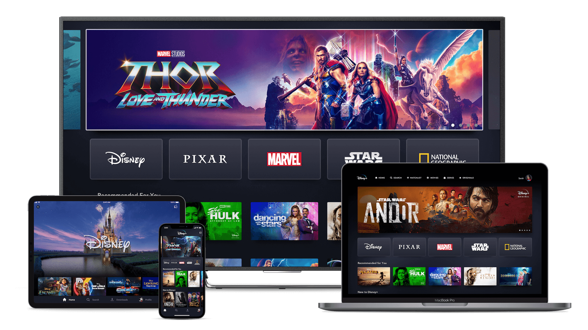
The basic design of Disney+ is still the same, with many rectangles in rows and a huge banner at the top. And most other streaming services aren’t much different. According to a new report from market research firm SmithGeiger for Variety, consumer opinions on streaming platforms design are tepid to negative almost across the board. With 39% of those asked, described the overall quality of the streaming user experience as “very good”. However, a larger total percentage (42%) said the overall experience was “good,” “fair” or “poor.”
SmithGeiger SVP of Insights & Strategy Dan Reines told VIP+:
“these are pretty low satisfaction numbers. Usually, on a five-point scale, we would want the top two boxes (‘very good/great’) to be in the 70s or so, and the top box (‘great’) should be the biggest number. The fact that there are so many people at ‘good’ — the middle choice — suggests that people are kind of shrugging … Nobody’s particularly thrilled with the general user experience.”
As you might expect, Netflix was considered the streaming service with the best design, with 42% of the votes, with Hulu taking second place at 12%. With Disney+ and Amazon Prime Video both sitting in the third position at 10%, above Max at 8%.
Disney+ has a very simple design style, which isn’t necessarily a bad thing, but when it’s compared to Netflix’s, it’s easy to see why people prefer Netflix. Netflix mixes things up much more, changing not just the thumbnails regularly, to make them look fresh, but also in mixing in different styles. It also has an incredible algorithm to offer its profile users a unique experience. Jumping from one profile to another, the entire homepage can change depending on that profile’s viewing habits. Something Disney+ doesn’t offer to the same extent.
Almost every streaming service, including Disney+, has generally copied aspects from Netflix, such as the tile layout and the category/genre-based rows. But consumers still view Netflix’s experience as much higher than Hulu or Disney+.
Hopefully, with the upcoming changes to Disney+ as part of a radical shift to include Hulu content in Disney+ in the United States, which has been in development for over a year, we will finally see a change in how Disney+ looks. There are many different things they could do, and internationally, the Star hub is in drastic need of some changes, since this hub has over a thousand items in it, compared to Pixar or Star Wars, which don’t even hit triple numbers!
Back at last year’s Disney+ Day, it introduced some different options on the home page to make it look a little different, but those were quickly removed, and the design returned to usual. Many of the changes to the design of Disney+ probably haven’t been noticed by the majority of its users, but the survey results in state that consumers are struggling to navigate or find the content they want to watch, which is something all streaming services are constantly trying to improve, but maybe Disney+ needs a bit of a kick to mix things up a little more, to give us all a better experience.
Do you think Disney+ needs some better design choices? Let us know on social media!